
Logo transition can be as drastic as an image of Newton sitting under an apple tree changed to just an apple fruit with a bite. That is a true story by the way, based on Apple Inc. Brands themselves are changing so it’s not surprising that logo trends follow suit.
Pretty much any company that has lasted for 10 years or more has changed their logo at least once. That’s a testament to how trends are shifting from one to another through the years. This is caused by various reasons, one of which is the rapid change in technology trends.
Some logo trends only last for a few months, which is unfortunate for those who use them. However, some last for a few years, then disappear and make a comeback several years later. This article discusses some of the trends that would most likely make an appearance in 2021. Most of them are prevalent during recent years and some are making a comeback.
![]()
Logo Trends Table of Contents
The importance of a logo to a business varies. It could be for marketing purposes, for facilitating brand loyalty, or for distinguishing a company from its competition. First and foremost, however, a logo is used to represent the identity of a brand. Every other reason is secondary. Important, but secondary.
With that in mind, deciding what type of logo to go for isn’t as easy as picking the prettiest-looking one. There must be some criteria to consider. According to LogoMaker, there are five important elements in logo design (LogoMaker, 2017). Basically, a logo must be simple, unique, versatile, memorable, and relevant.
Source: thirdside.co
That makes a lot of sense. However, there’s another factor that must also be taken into account: trends. It’s true that there’s no guarantee of a trend lasting for a long time. However, it’s still important to take notice of them. They are a good indicator of what key design elements in terms of color, layout, etc. would stay. After all, while brand strategy doesn’t start and end with a logo, it’s still an important aspect of it.
Why is it important to keep up with logo trends?
Staying updated with logo design trends is crucial for maintaining a modern and relevant brand identity. Trends in logo design evolve over time as businesses aim to align themselves with changing consumer preferences, cultural shifts, and technological innovations. Here’s why keeping up with these trends is so important:
- Reflects Your Brand’s Evolution: Your logo serves as a visual representation of your brand. As your company evolves, so should your logo. Aligning with current design trends ensures your brand remains fresh and reflects its values, goals, and audience. For instance, many companies update their logos to stay visually appealing and avoid appearing outdated.
- Appeals to Modern Audiences: Logo trends often stem from broader shifts in design preferences, cultural changes, and the technological landscape. A modern logo can attract a younger, more digital-savvy audience who may be drawn to contemporary aesthetics like minimalist or geometric designs. If your logo looks outdated or does not resonate with your target demographic, you risk losing potential customers.
- Incorporates Advancements in Design Tools: The rise of design tools, AI, and new technologies such as AR and VR has influenced how logos are created and presented. Keeping up with design trends allows your brand to leverage these innovations to create more dynamic and engaging logos, particularly in the digital space where animation and interactive elements are becoming increasingly popular.
- Stays Competitive in Your Industry: Your logo is a key differentiator in a competitive market. If your competitors adopt new trends and you don’t, you could risk blending into the background. Following logo trends lets you set your brand apart visually and maintain a competitive edge.
With that said, let’s run down the logo trends that are redefining the looks of businesses.
1. Minimalist Logo
“Less is more” is an adage perfect for logo design philosophy as well. Since the early minimalist movement began about 50 years ago, this trend has never faded. Some contemporary brands, such as the ones in fashion and tech industries, prefer clutter-free design.
This approach, however, must not be confused with lazy and effortless work. Minimalism isn’t simply stripping the design to its bare minimum. Rather, it’s the art of clearing away noises so that a clean, naked image remains, with its message shining through. It provides a solid foundation and leaves room for the imagination.
![]()
There are numerous ways to achieve a minimalist logo design. One is using only a text depicting brands as the entire design itself. The most famous examples of this include the icons used by Google, eBay, and Amazon. Another minimalist method is the one employed by Apple that uses a little symbol without any text on it.
This design philosophy has taken a firm hold in the field of digital design recently. There are several reasons for that. First is that simplified logos are visually more appealing on mobile screens. Also, fewer pixel elements to render means faster load times. Another great thing about this is that the logo design looks great in both small and big sizes. This means that it can be embedded in practically any object and the logo would still look amazing.
Many companies have seen the potential of minimalism in logo design in terms of marketing value. As a result, a lot of brands have made the transition from a complex logo to a more simplified one. This includes Starbucks, Apple, and McDonald’s.

This sweeping white space and the logo at the center characterizes minimalist logo design.
Why is a simple logo good?
- Brands are easier to recognize and remember
- The design has a modern feel to it
- Message can be delivered more easily
- It’s more scalable
- The logo is less likely to be copied by other brands
- Simpler logos are easier to embed anywhere
2. Highly-Detailed Logo
A logo is akin to a painting on a canvas whose main purpose is to represent a brand. The main difference is that logos are usually created for a very small canvas. It should also be able to fit across different platforms or objects like websites, mobile apps, t-shirts, paper, etc. With this in mind, the odds of creating a good, highly-detailed logo are pretty low.
However, logo designers whose motto is “More is more” are going against those odds. This might be especially true in businesses belonging to the food and beverage industry. It will usually consist of hand-drawn images and texts that welcome details instead of taking them away.
This trend is practically the polar opposite of minimalism. Therefore, it’s only normal that it throws away every minimalist philosophy out of the window. This includes filling up negative spaces, shading, and attention to minor details.
The logo is full of small details like paper tears, shadows and the smoke from the drink.
Advantages of Highly-detailed Logo
- It stands out since most logos are created with minimalist design
- Consumers might examine your logo more carefully, creating a better impression
- It conveys more information so viewers can get what your brand is all about
- You can write your brand’s tagline in the logo which might be good for marketing
3. Hand-Made Logo
In recent years, logo design trends have inclined towards modernization and digitization. Thus, many businesses believe that going back to a more vintage style will make their brands more distinguished. One method of doing so is through the use of handwritten or hand-drawn designs.
Logos with hand-made design provides an authentic feel to customers. This type of design has actually gained traction again over the last few years. And signs seem to point to this trend being strong in 2020.
Consumers are becoming more conscious of the value behind a brand’s face. Therefore, having a handmade logo somehow projects a company’s seriousness about its products and services. And that’s a positive thing. This also provides brands with a personality that customers would take note of. Moreover, since the work is done with freehand, there is a great degree of freedom attached to making it.
Hand-drawn logos are also free from the generic elements of digital design which uses templates as an inspiration. A design would less likely include the common water droplet symbol when making a logo for companies providing water-based services. Roofing image isn’t necessarily present in leasing, real estate, and home repair businesses. The list goes on.
A mixture of a hand-drawn image and a handwritten text.
Famous brands with hand-made logos:
- Pizza Hut
- Kleenex
- Coca-Cola
- Mail Chimp
- Cadbury
4. Fine Lines Logo
Minimalism meets geometry with lines instead of shapes. Just like shapes, lines are also able to convey information and feeling. Fine lines logo are proven to be a popular design choice in recent years. That success will seem to carry over the next year as well.
Since lines are one of the main design components, their versatility is off the charts. They can be easily adapted and manipulated to make shapes and texts. Straight lines express a feeling of structure and order, overlapping lines create depth and wavy lines convey clarity. That’s why they’re perfectly capable of forming into something that can represent a brand.
While simpler than other logo types, it still takes skills to create a stunning and meaningful logo with fine lines. However, since it’s also simpler, then a relatively inexperienced person can dabble with it. And with enough information and trials, a fitting design might be created. This is ideal for making personal logos or when hiring a professional isn’t feasible.
The entire IBM logo is made from the combination of literal and implied lines.
Types of lines present in Fine Lines Logo
- Literal line – the actual line you can see
- Implied line – an imaginary line instantly created by your mind when it connects elements
- Contour line – primarily used for defining edges and making boundaries
- Dividing line – usually a type of implied line used to divide spaced between elements
- Decorative line – used to embellish an element by adding shading, depth, texture, etc.
5. Responsive logo
The mobile trend isn’t going anywhere soon because it’s still one of the top marketing trends in 2019. In fact, making designs that’ll look good on any screen size is a standard in today’s field of digital graphics. Thus, it’s to no one’s surprise that responsive logos are still on-board the trend train.
There was an old rule that brands used to follow: “do not change your logo”. It might have held its ground for decades but today, it’s a less practical approach. That’s because there’s simply a lot of places today where a logo would show up. From big screens to smartphones, and everything in between. That’s why responsive logos are more than just gimmicks or fads but more of business necessity.
It’s not just about the size, however, because responsive logos are also being made more dynamic. This means that a logo would look or behave differently depending on different conditions. For instance, there are logos that are grayed out when the user is signed out and more vibrant when signed in.
There’s also a lot of brands today that use a different version of their logo for different screen sizes. One of the most famous is Disney. At full size, it includes the entire suite—“Walt Disney”—with a castle on top. On smaller screens, the castle is gone and only “Walt Disney” remains. When shown on an even smaller display, only the word “Disney” remains. And on really small screens, the logo is reduced to a single but still distinguishable letter, “D.”
![]()
Other Types of Responsive Logo:
- Generative or “Living” Logos – constantly changes based on predetermined brand language or algorithm.
- Adaptive Logos – adapts to varying screen sizes
- Variables Logos – certain aspects change depending on different conditions
- Contextual Logos – adapts where they are used
Top Graphic Design Software
- Adobe Photoshop CC. This photo, image, and graphic design editing software is designed for professionals who want to have maximum manipulation capabilities. Get to know this application in our Adobe Photoshop CC review.
- Adobe Illustrator CC. This graphic design tool is reserved for artists who want to create vectors for a wide variety of platforms. Our Adobe Illustrator CC review can enlighten you about this software.
- Adobe InDesign CC. This solution is for print and desktop publishing and has tools that let you control page layouts to the fullest. Discover what else you can do with this platform in this Adobe InDesign CC review.
- Canva. This application removes the complexity out of graphics design with its intuitive tools. You can explore its other features in our Canva review.
- GIMP. This free and open-source image editing software is an alternative to Adobe Photoshop with its professional tools. You can further get acquainted with its capabilities in this GIMP review.
6. Gradient Logo
Color has been one of the main components in making a design. And logo artists playing with them is a trend to stay. Just by making the color shift into a different spectrum without touching other design elements achieves a bunch of benefits. It makes the logo more exciting, playful, alive and animated. What more if it’s combined with other design changes?
Instead of just blending colors, they are being used more playfully with adjacent shades. It’s not just a random selection of color, however. Artists put meticulous thought and a series of testing to determine which color combinations uplift a design.
The gradient trend was popularized by Instagram. It’s not an easy ride though. When the social media platform changed its logo in 2016, it was first ridiculed. NY Times even called the event “the Great Instagram Logo Freakout of 2016” and described the logo as a travesty. After that, however, the internet has seen a flood of gradient logos.
Some brands, such as Apple Music and Firefox, are using a full-on gradient in their design. However, it can also be used more subtly and still achieve good transition effects. Examples of this include Disney Plus, Google, and Trivago.
Source: 99designs, 2019
Dos and Don’ts of Gradient Logo Design:
- Create a solid version of the logo first before adding gradients
- Use gradient in a manner that’s relevant to your brand
- Optimize your gradient for printing
- Don’t add gradients in a way that’ll make the logo difficult to read
- Avoid the use of gradient to make an abstract imagery
- Don’t ignore printing concerns
7. Typography Logo
Google, Yahoo, Shapes, Amazon, FedEx, CNN, Netflix, and IBM. These are just some of the companies that use their brand names as their logo as well. And we’ll keep seeing this trend further.
This isn’t necessarily an emerging trend. In fact, it has been around for quite some time. However, in 2020, this trend’s versatility will still be utilized by many companies. There’s just a lot of benefits that typography-based logos offer that image-based symbols don’t.
One practice that keeps this trend alive is brands creating their own font. Companies continue to reject both serif and sans-serif fonts available and just go through the trouble of creating their own. This includes Netflix, Uber, and Airbnb. They do this to make themselves distinguished among the digital world full of logos using Helvetica, Trajan, and Garamond.
Minimalists also use typography in their design. In fact, a lot of minimalist logos out there are made up of just one or two letters. “f” of Facebook, “t” of Twitter, and “in” of LinkedIn are some of the most popular examples.
Text-based logos could also take advantage of the brain’s natural tendency to memorize shapes and colors. As a logo that uses visuals, our brains like them. But they’re also a word or letters of the brand they represent. Therefore it’s easier for us to link them with their actual name when we see or recall the image.

Other examples of companies using Typography Logo
- Coca-Cola
- Cadbury
- Canon
- Tumblr
- Lego
- NASA
- Hulu
- Philips
8. Geometric Shape Logo
Geometric shapes are mainly associated with math—a cold logic and number-based field. However, designers are giving them a warmer, more vibrant look to invoke the feeling of relaxation and happiness. Thanks to this and other reasons, the trend of them being used in logo design continues.
While the review of famous company logos shows that color is used to invoke emotions, so do shapes. In fact, shapes have lots of use cases in graphic design, and conveying meaning is just one of them. This is perfect for logos that are meant to be symbolic. Curvy edges express ease, square gives the feeling of strength, triangle means stability, and so on. These are positive attributes that businesses would want their brand to be associated with.
Geometric shapes for logos are also used to achieve a modern feel with a sleek appearance. When done right, they could capture the essence of the brand they represent in a conceptual and elegant way. And with just a change in line thickness, color, or layering, artists could detach the logo from its frigid roots. This could result in a lighter and more personal feel for customers.
However, perhaps the biggest advantage that geometric shape logos offer is the simplification of intricate figures. Logos can be placed on both small and big objects, screens, etc. Therefore, it’s important that even on small sizes, they are still distinguishable. Good geometric design will ensure that a logo’s tiny version is not reduced to a random doodle.
Three identical geometric shapes form the Mitsubishi’s logo.
Common Meaning of Shapes in a Logo:
- Rectangle and Square – efficiency, strength, and professionalism
- Triangle (upright) – tension, stability, and change
- Triangle (inverse) – instability
- Circle – continuity, protection, and standing out
- Organic and Spiral – fluid and whimsical
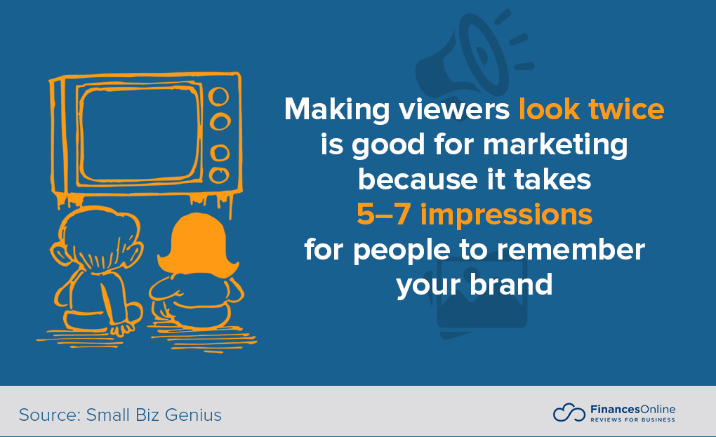
9. Eye-Tricking Logo
This is an innovative logo trend that we’ll be seeing for some time mainly because of how cool it is. It makes use of one of the most creative ways to engage customers—making them look twice. With that alone, your chance for brand recognition increases.
Logo designers manipulate the viewers’ perception of an image to make it look like it defies nature’s logic. This can be done in several ways such as shading, use of negative space, distortion, surreal imagery, etc. With those techniques, a logo could look visually broken, warped, bent, or fragmented—inviting viewers to look more closely.
Some of the most common ways to achieve this are by playing with viewers’ perception of depth. This blurs the line between 2D images and 3D objects. From a customer’s perspective, it looks like the logo is sticking out. However, the unsurprising but still amusing clincher is that the image is purely in 2D. Entertaining viewers is a good way of increasing brand recollection.
Another variation of this trend is the creation of logos with a hidden image in them. Unsuspecting onlookers won’t necessarily look twice when viewing this type of logo for the first time. However, when someone points it out, you can bet that people would be inspecting them more closely. As a big bonus, people will share them on their social media account. Free advertising!
Logos with hidden meaning:
- Toyota – it includes every letter of the company name
- Pinterest – the “P” is an image of a board pin
- FedEx – there’s an arrow between the negative space of “E” and “x”
- Hyundai – the “H” represents two people shaking hands
- Sony Ericsson – the logo is formed by overlapping “S” and “e”
- Vaio – “Va” represents analog and “io” symbolizes digital
- Amazon – the smile is also an arrow pointing from A to Z
- Toblerone – the negative space in the middle resembles a bear
10. Half Flat Logo
It was 2012 when flat design became the standard in logo making. However, with long shadows that became prevalent in 2018, Flat 2.0 or Half-Flat logos were born. The subtle use of shadows and added details make a significant visual improvement to the otherwise flat image. This is an ideal choice for those who want to add visual interest to their logos without going full-3D.
The use of a flat image is still a prominent design philosophy these days. Therefore, to stand out from the competition, companies are going for flat logos with 3D feel. This is great because there’s no need to shy away from the use of flat logos, especially for those who prefer them. Instead, artists only need to add a few realistic touches like shadows to make images pop out a little.
This trend’s popularity can be attributed to its capability to get around the drawbacks of flat design. For instance, flat logos might not be able to convey their meaning because of the design’s limitation. Also, the transition from flat to flat 2.0 expresses brands’ readiness to embrace a modern and adaptive approach to their services. Finally, this is a good logo design for companies that are new to the business. That’s because semi-flat logos can convey their vibe quicker by adding details to their flat design.
The extra shadings and shadows make the otherwise flat logo pop out a little.
Reasons why brands transform their logo half-flat
- Trendy – it looks modern and appealing
- Simplified – avoids too much use of shadow or gradient
- Flexible – works with animations, websites, and can be redesigned easily
- Easy to remember – not overloaded with details
- Enhanced UX – clear visual hierarchy
- Crisp visuals – uncluttered and creative
11. More Rebrands and Expensive Logos
In 2020, some iconic brands took to rebranding to change with the times. Logo changes are subtle but provide the brands with an updated look that resonates better with their target market. For instance, Rolls-Royce changed its lettermark logo and pictorial logo. It became sleeker and more modern.
Other famous brands also did rebrands during the year. These include GoDaddy, Intel, and Medium. In the coming years, as company outlooks change with the composition of populations, we expect more logo rebrandings. These rebrands show that the companies are moving on to their next phase, strengthening their commitment to being relevant with the times.
Logos represent brands. Skimping on them will likely have a negative effect on their brand image and reputation. This is why many spend millions on rebranding. As of July 2019, the top ten most expensive logos came not only from big brands but also cities.
- Symantec – $1.28 billion
- BP – $200 million
- Cardiff City Bluebirds – $100 million
- Posten Norge – $55 million
- Tropicana – $35 million
- I Love NY – $16 million
- BBC – $1.8 million
- Pepsi – $1 million
- City of Melbourne – $630,000
- City of Belfast – $280, 000
Popular Rebrands of 2020
- Rolls-Royce
- Intel
- GoDaddy
- Medium
- Fast Company
12. PSA’s with Clever Logo Changes
In 2020, especially with the COVID-19 pandemic, brands were expected to do their part in making the economy more resilient. Consumers are looking for brands to provide them with security and safety. Also, they expect brands to proactively provide real value, act responsibly, and provide help to their communities and employees (Kantar, 2020).
Brands like Coca-Cola, Krispy Kreme, McDonald’s, and Nike have been actively putting out messages showing support for social distancing during the pandemic. McDonald’s and Coca-Cola even cleverly tweaked their logo to represent the safety measure. Car brands like Audi and Volkswagen also chimed in.

Source: The Agency Creative
Consumers expect brands to be socially responsible. This means brands are to be more visible. Logos show their presence especially in societal issues dear to consumers. More creatives are likely to use this clever tactic moving forward.
PSAs and Social Responsibility Logo Trends
- Brands may tweak their logos to show solidarity to a cause or for the duration of a campaign.
- It is important for brands to be visibly proactive in helping communities.
- People appreciate cleverly delivered messages.
- Temporarily changing a logo that defines a brand can show that a brand is willing to go to great lengths for a cause.
What makes a successful logo?
Trends come and go. However, the key to making a successful logo isn’t creating one that can weather every change. It’s more on being distinctive, simple, relevant, and most importantly, can properly identify your brand.
While going with every flow is impractical and unnecessary, knowing what’s in and what’s popular is helpful. It can tell you when to change your logo and what type is best suited to your brand. It also allows you to identify which trend your competitors are following. This way, you can either get on the bandwagon or choose to distinguish yourself.
However, it’s of utmost importance that you still follow your identity because that’s what a logo is primarily used for. According to this set of graphic design statistics, blue is the most used color by most successful companies because of its effectiveness.
However, it doesn’t mean you must absolutely follow suit even if it’s not compatible with your brand. Everything must relate to you. And whenever you need to make adjustments, you can choose a graphic design software that can help you achieve your vision.
Key Insights
- Evolving Trends: Logo design trends are constantly changing, influenced by technological advancements and shifts in consumer preferences.
- Minimalism Prevails: Minimalist logos remain popular for their simplicity, scalability, and modern appeal, with major brands like Apple and McDonald’s adopting cleaner designs.
- Detail-Oriented Logos: Highly-detailed logos, though less common, offer a rich, intricate representation of a brand, often seen in the food and beverage industry.
- Hand-Made Appeal: Hand-drawn or handwritten logos provide an authentic, vintage feel, connecting with consumers on a more personal level.
- Versatile Designs: Fine lines and geometric shapes are used to convey structure, order, and modernity, making logos versatile and adaptable across various platforms.
- Responsive Logos: With the rise of mobile usage, logos need to be responsive, adapting to different screen sizes and conditions while maintaining brand identity.
- Color Play: Gradient logos, popularized by brands like Instagram, bring vibrancy and dynamism, making logos more visually appealing.
- Typography Trends: Text-based logos, often using custom fonts, remain a strong trend, with companies like Google and Coca-Cola exemplifying the style.
- Innovative Techniques: Eye-tricking logos use optical illusions and hidden images to engage viewers, enhancing brand recall.
- Strategic Rebranding: Rebranding efforts, seen with companies like Rolls-Royce and GoDaddy, reflect a brand’s evolution and relevance to current market trends.
- Social Responsibility: Brands are increasingly using logo changes to support social causes and demonstrate corporate responsibility, as seen during the COVID-19 pandemic.
FAQ
1. Why do companies change their logos?
Companies change their logos to stay relevant, reflect changes in their brand identity, adapt to new market trends, and modernize their image. Logo redesigns can also signify a strategic shift or new direction for the company.
2. What are the benefits of a minimalist logo?
A minimalist logo is easy to recognize and remember, scalable across different platforms, and delivers a clear, modern message. It also reduces visual clutter, making the brand more distinguishable.
3. How do responsive logos work?
Responsive logos adapt to different screen sizes and conditions. They may change in complexity or detail depending on the platform, ensuring that the logo remains effective and recognizable on both large and small screens.
4. What makes hand-made logos appealing to consumers?
Hand-made logos offer an authentic and personal touch, suggesting that the brand values craftsmanship and tradition. This style helps brands stand out in a digital world dominated by clean, uniform designs.
5. Why are gradient logos popular?
Gradient logos are popular because they add depth, dimension, and vibrancy to a design. They make logos more dynamic and engaging, capturing the viewer’s attention through color transitions.
6. How can geometric shapes be used in logo design?
Geometric shapes convey a sense of structure, stability, and modernity. Different shapes have different symbolic meanings, such as circles representing continuity and triangles suggesting stability. These shapes help create a clean, professional look.
7. What is the significance of typography in logos?
Typography in logos focuses on using text as the main design element. Custom fonts can make a brand distinctive and memorable, and the simplicity of text-based logos ensures clarity and direct communication of the brand name.
8. How do eye-tricking logos enhance brand recall?
Eye-tricking logos engage viewers by making them look twice, often using optical illusions or hidden images. This creative approach makes the logo more memorable and encourages sharing on social media, increasing brand visibility.
9. What drives companies to rebrand their logos?
Companies rebrand their logos to align with changes in their market strategy, target audience, or brand values. Rebranding can also rejuvenate a brand’s image, keeping it relevant and appealing in a competitive market.
10. How can logos support social responsibility initiatives?
Logos can support social responsibility initiatives by incorporating elements or changes that symbolize support for a cause. Temporary logo changes can raise awareness and show that the brand is committed to making a positive impact on society.
References:
- Kantar (2020). COVID-19: What do consumers expect from brands?. Retrieved from Kantar
- Ooley, A. (2017). The 5 Fundamental Branding Elements of Logo Design. Retrieved from LogoMaker


Leave a comment!