
Nowadays, consumers expect ecommerce businesses to deliver a top-notch user experience. After all, a recent ecommerce survey revealed that 33% of shoppers become loyal to a brand when they can easily shop online. This can be implemented by designing a seamless checkout process using shopping cart software. Users should be able to easily manage their shopping cart just like when using an in-store basket. The best design practices for shopping carts aim to reduce abandonment by improving the overall user experience.
Factors such as user interactions and distractions, account selection and creation, credit card form, and even field design and features, all contribute to friction and user frustration, which eventually leads to cart abandonment. Here, we provide shopping cart design best practices, as well as guidelines on how to build your own shopping cart using HTML or CSS.

Best Design Practices for Shopping Carts Table of Contents
In 2022, approximately 71.4% of online shopping carts are abandoned before purchase. This could be due to a number of reasons, ranging from high delivery fees to the unavailability of the products that the customer wants to purchase. However, in some cases, it is brought about by easily addressed concerns such as inconvenient checkout processes.
In fact, research by Baymard Institute discovered that ecommerce sites stand to gain a 35.26% increase in conversion rate through better checkout design. Given the $738 billion worth of ecommerce sales in the United States and the European Union combined, this means that the recorded $260 billion worth of lost orders can be easily recovered if more resources went into shopping cart design improvement.
The latest benchmark study of 71 ecommerce websites show that, overall, user experience during checkout range from mediocre to decent. Moreover, an average site has 21 preventable usability issues in the checkout flow. This only goes to show that, by taking the proper steps in managing and optimizing a shopping cart, businesses can drastically reduce abandoned carts and increase conversions.
Common Shopping Cart Design Pitfalls
A benchmark study of 71 ecommerce websites
REQUIRED and OPTIONAL fields are not marked explicitly: 85
REQUIRED and OPTIONAL fields are not marked explicitly
%Requiring users to click on the APPLY button rather than auto-updating fields: 82
Requiring users to click on the APPLY button rather than auto-updating fields
%Not allowing users to edit data directly at the ORDER REVIEW step: 80
Not allowing users to edit data directly at the ORDER REVIEW step
%Overly complex password-creation requirements: 80
Overly complex password-creation requirements
%GUEST CHECKOUT not displayed as a prominent option: 65
GUEST CHECKOUT not displayed as a prominent option
%STORE PICKUP not offered as an option in shipping selector interface: 63
STORE PICKUP not offered as an option in shipping selector interface
%Not providing fully functional BACK to navigate previous views: 57
Not providing fully functional BACK to navigate previous views
%Not providing localized input masks for restricted inputs: 56
Not providing localized input masks for restricted inputs
%Incorrect formatting of credit card "Expiration Date" field: 50
Incorrect formatting of credit card "Expiration Date" field
%Source: Baymard Institute 2021
Designed byThe following best design practices for shopping carts aim to provide strategies for reducing your cart abandonment rate. While online shopping trends have constantly changed through the introduction of new technologies, ecommerce sites still have a long way to go when it comes to providing a superior customer experience.
This article on best design practices for shopping carts also mentions the often overlooked details in the checkout process that significantly contribute to abandonment. A guide to setting up your own shopping cart for your ecommerce business is also provided.
Shopping Cart UI Design Best Practices
1. Make the Shopping Cart Icon Easy to Locate
The “Add to Cart” button should be prominent on every page and the shopping cart should automatically reflect the items added to the cart. In 2021, 16% of online shoppers abandoned their carts as they could not see or calculate the total cost of their cart items upfront. The customer primarily interacts with the shopping cart icon even before proceeding to check out, thus it is important to maximize the use of the shopping cart icon.
In many sites, the shopping cart icon, which also displays the number of items in the cart, is placed at the upper right corner of the page to allow the user to preview the selection, edit the selection if needed, and see the total cost. Most ecommerce sites also provide a drop-down menu when you click on the shopping cart icon so users can easily see the items in the cart and not just the quantity. In addition, a pop-up should also appear to confirm whenever items are added to the cart.

Tilly’s automatically shows the cart contents, including the subtotal, as items are added to the cart.
2. Allow Users to Manage Their Cart
While the ultimate objective is for the customer to check out the items in the cart, do not automatically take customers to the checkout page. Simulate the physical store where customers check for alternatives and compare prices.
In the same manner, allow customers to view their carts, and provide them with the option to continue adding more items. For this process to be seamless, you have to ensure that your “Back” button is functional. Avoid the mistake of 57% of sites not providing support to the “Back” button for navigating to any previous page prior to checkout.
Part of shopping cart management is when the user reviews the order as part of the checkout flow. Editing orders at the review order stage need not be a cumbersome process. This step, however, is a major area of weakness as 80% of sites do not allow users to easily edit order information. Users are forced to go a few steps backward, which disorients and at the same time discourages them from completing the purchase. This can be addressed by using inline form fields or page overlays. Also, it is important to provide separate “Edit” links for all distinct information groups to optimize the checkout flow.
Source: Royal Mail UK
3. Provide Complete Product Details
Customers do not like the idea of going back and forth when confirming purchases, so make it a point to include the complete details of products that have been added to the cart. These include clear and bright thumbnails of the product, information such as size, color, price, and the number of items that the user is about to purchase. Most importantly, provide a link that takes the customer back to the main product page.
While research has shown that 58.6% of shoppers are just browsing and do not really intend to buy, 30% end up purchasing the same product at a later date after cart abandonment. Providing them with complete product details will increase the likelihood that they will save the items on their wishlists and purchase them. This would also eliminate cart abandonment due to technical errors, which happen when users are not able to access the product page to review the items that they intend to buy.
Source: JungleScout Consumer Trends Report Q2 2022
4. Display the Total Order Cost
Online customers do not like hidden costs, and it is one of the reasons they abandon carts. To ensure users eventually make the purchase, provide an option to calculate how much shipping would cost, plus all the applicable taxes. Among online shoppers in 2021, 17% admitted to abandoning their online transactions due to the failure of the site to display the total cost. If you cannot provide an estimate, add a shipping calculator tool that customers can use to find out their total purchase cost.
It would also be useful to let the user know how much the minimum order amount is to qualify for free shipping and to automatically apply promo or discount codes. Free shipping increased the revenues of 50% of small and mid-sized businesses in 2021, which shows that free shipping offers drive customers to complete their purchases.
It is also important to see to it that your site is optimized for mobile. Most customers would abandon carts once they find it difficult to navigate a site when using their mobile device. In the United States alone, mobile phone shoppers had the highest abandonment rate at 80.5% in 2021, followed by tablet shoppers at 71.6%.
5. Use the Contents of the Cart to Upsell or Cross-Sell
Research shows that 10% to 30% of most ecommerce revenue is generated through upselling. Cross-selling and upselling benefit both the customer and the retailer. Often customers need another item to use with the product that they are about to purchase, and cross-selling reminds them to buy that too, such as battery or adapter for an electronic device. Some customers, on the other hand, are keen on exploring the higher product tier and welcome the upselling offers of retailers. The technique is to know your customer’s purchase behavior so you can do better targeting.
To facilitate better upselling in your ecommerce site, categorize your products into different tiers. Keep the offers simple and personal, and only offer highly relevant products that have better features. In doing this, the customer will be able to see the benefits of upgrading. In addition to offering similar products or options, you can also promote your bestsellers or highlight products with the best customer reviews.
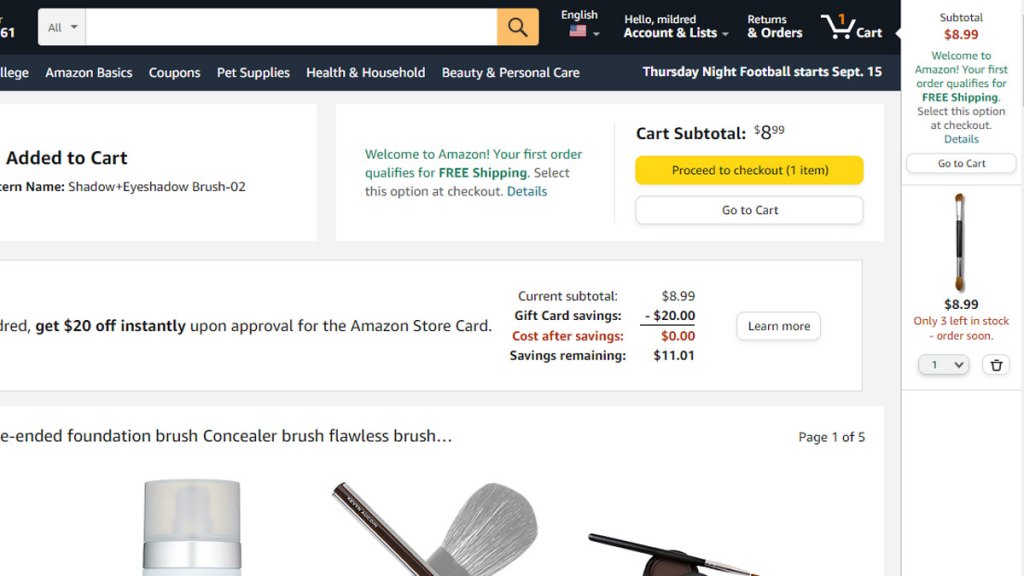
The Amazon shopping cart has a clean and simple layout that displays the contents of your cart, as well as other offers while keeping the checkout button prominent.
6. Lead Customers Toward the Checkout
The checkout button should be prominent in your page layout. A better checkout design can result in a 35.26% increase in conversion rate. Remember, keep your layout simple with a visually compelling CTA. The checkout button should stand out in your overall page layout.
Use Trust Signals
To address security concerns and boost customer trust, display the logo of the accepted payment methods and your site’s security certificate. Online stores that provide multiple payment options are trusted more by 40% of shoppers, while 80% of them feel more secure when they see credit card logos on the website checkout page.
Providing links to your return policy and FAQ also ensure users that you are sincere in doing business with them. It is important to note that 35% of shoppers are very likely to shop more if an online store made the returns process simpler, while an unsatisfactory return policy forces 10% of shoppers to abandon their cart.
Shipping information is another crucial factor in completing a purchase. Given the increasing importance of the store pickup option, sites need to ensure that this aspect is optimized. Among ecommerce sites, 63% do not offer a “Store Pickup” option within the shipping selector interface. Offering it alongside other shipping options will ensure that all possible user preferences are covered.
Keep The Payment Process Simple
While form fields abound in the checkout process, a closer look revealed that 85% of sites do not mark required and optional fields explicitly. In addition, the checkout micro-copy and field labels often confuse users. For example, a user encoding credit card information will understand “Security Code” but some sites use “CSC” as the label for the field requiring this information.
There are sites that replicate the exact layout of the credit card, which is a good practice, allowing users to breeze through the payment process. Credit card fields require the most complex inputs, thus keeping it as simple as possible by matching the sequence to the physical card sequence can eliminate abandonments.
Source: 2021 SalesCycle eCommerce Statistics and Trends Report
7. Provide the Option to Check Out as a Guest
Research has established that 55% of shoppers are more likely to buy if there is an easier and quicker way to buy a product they saw online. Not all users want to create an account, and chances are they will abandon their cart once you ask them to create one. The long list of password requirements is enough to discourage a potential customer.
The sign-up barrier has long been identified by ecommerce marketers as a major roadblock to conversion, and yet, 80% of sites still make the password creation process overly complex. Thus, it is important to offer a guest checkout option so users can still buy from your site. Once they experience your quality service, they will opt to create an account and become your regular customer.
One benchmark study revealed that 65% of ecommerce sites have an account-selection step design that often makes it difficult for users to locate the guest option. When tested on mobile, 53% of users had difficulty identifying, seeing, and selecting “Guest Checkout” thus they ended up abandoning their carts. Moreover, it was found that most websites put the guest option below the fold instead of making it a prominent option.

At Staples, the Guest option is not displayed as a prominent option. Instead, it is located at the bottom, using small fonts.
8. Keep Track of Unpurchased Items in the Cart
For users that do have an account with your ecommerce site, you can send them an email to remind them of the items left in the cart. Abandoned cart emails have a 39.7% conversion rate, making them among the highest converting automated marketing messages. In addition, these types of emails have a 35% open rate. Moreover, cart abandonment emails that offer free shipping have the potential to recover more than 20% of abandoned carts.
You can also opt to allow users to have a wishlist or “save for later” option. Abandoned carts also provide an opportunity for you to make personalized emails and recommendations to customers that have the potential to increase engagement. Consumers appreciate being reminded of the products they browsed, with 25% admitting that they actually like seeing retargeted ads.

Setting Up A Shopping Cart for Your Business
Having an online shopping cart enables businesses to better engage customers and provide them with seamless transactions. Luckily, there are plenty of ways through which you can set up a shopping cart for your online storefront. Below we outline two of the most common ways to do this to help you get started.
Use A Shopping Cart Software
Perhaps the easiest way to build your ecommerce site is by using a shopping cart software. These platforms provide themed templates, as well as all the tools that will enable you to provide users with the best online shopping experience. Below are some of the leading solutions on the market that you may want to consider.
NetSuite
NetSuite SuiteCommerce is a cloud-based ecommerce platform that unifies the front- and back-end systems of your online store, which gives you more flexibility and adaptability. It equips ecommerce businesses with a rich set of tools that enables them to provide their customers with the best online shopping experience.
Wix
Wix is a complete ecommerce website. It lets you create an online store that is engaging and mobile-optimized. It has open APIs that connect your tools with other third-party solutions, which lets you scale your operations seamlessly.
Shopify
Shopify Plus is an enterprise ecommerce platform that provides a reliable ecommerce platform and a high level of data encryption. It has a plug-and-play platform and extends one-tap checkouts to customers.

Build Your Own Shopping Cart Using HTML or CSS
If you prefer having complete flexibility over your shopping cart, you can get a dedicated development team. Or, you may want to consider building your own using HTML or CSS. If you search the Internet for tutorials on “how to create an HTML shopping cart” or “how to build your shopping cart using CSS tutorial,” there are tons of videos and articles available. You can also apply the best practices for designing shopping carts outlined above to ensure smooth transactions for your customers.
In designing your CSS shopping cart, a basic knowledge of HTML or CSS is needed because both are necessary tools to build your online shopping basket. You can use your HTML or CSS shopping cart in building ecommerce websites. You may opt to make an HTML5 shopping cart to harness the power of HTML5 web storage.
Your shopping cart should allow users to view pages that contain products and add products to the cart. The user should also be able to review and update the contents of the shopping cart. Most importantly, your shopping cart should be able to capture user data and pass it from one page to another for a smooth checkout experience.
You can build your shopping cart, HTML or CSS code as the basic building blocks, with the help of tutorials that you can find online. You can refer to this tutorial for building a shopping cart using HTML and CSS online.

A simple and straightforward shopping cart built using HTML
Boost Conversions with These Best Design Practices
Research has established that every purchase is emotional, which is why it is important to provide the best user experience. The ultimate objective of the best design practices for shopping carts is to give users freedom and flexibility, and eventually eliminate the perceived limitations and inconveniences of shopping online.
This is where building your own shopping cart using HTML or perhaps CSS can be useful as this gives you free rein over the functionalities of your checkout page as well as its UI design. In case this becomes too complicated for you, a good alternative is using shopping cart software for your online store. If you are looking for an ecommerce platform, you may refer to this detailed comparison of 15 shopping cart software.
Whichever path you choose, designing your shopping cart requires that you uncover what brings convenience and satisfaction to users. In this regard, the best practices outlined here can help you produce good outcomes. By adopting them, you are one step closer to turning your website visitors into loyal customers.


Leave a comment!