
In the campaign pipeline, we often give more attention to the ad or post and landing page. And why not? The ad or post hooks our prospects while the landing page converts them into leads. Two very important elements. They also greatly contribute to lead conversion form optimization.
But there’s an element that’s easy to overlook, the third pillar to a great campaign: form. All three elements are important in growing your business through lead generation. Prospects who have reached your form are already pre-sold to your offer, so forms aren’t much of a make-or-break element. Well, wrong.
Aside from using form automation tools, recognizing the fact that how you build forms does impact your campaign. It’s not all fields and the signup button. There are, in fact, 5 components of a lead capture form that must be optimized if you want to increase your lead volume.

What are the 5 important components of a lead capture form?
- Clear CTA
- Right no. of fields
- Smart features
- Regular testing
- Privacy is highlighted
Location is king
There is no doubt that using a CRM software platform boosts your lead conversion rates. But there’s also the question of where to position your form on a landing page. Some say it should be above the fold so it’s easily spotted. Others argue that the fold, which is the imaginary line between the part of the page you see at once and the part below it when you scroll, is a myth. So, which is which?
Smart Insights puts things in perspective: it isn’t about the fold, really. The form (they actually said CTA) “should be placed where an action is most likely to be taken.” It makes sense. Place the form above the fold where it elbows out your key message and it self-defeats the purpose. Bury the form way below and prospects might miss it.
Where to place the form then depends on the narrative of your landing page. This much you should know: the form has to be an integral element in the flow of your messaging. If you need a long copy to convince prospects, the form is likely below the fold, somewhere near the end of the narrative when prospects are all prepped up to opt in. If prospects are already pre-sold by the time they land on your form, then banner the form by all means.
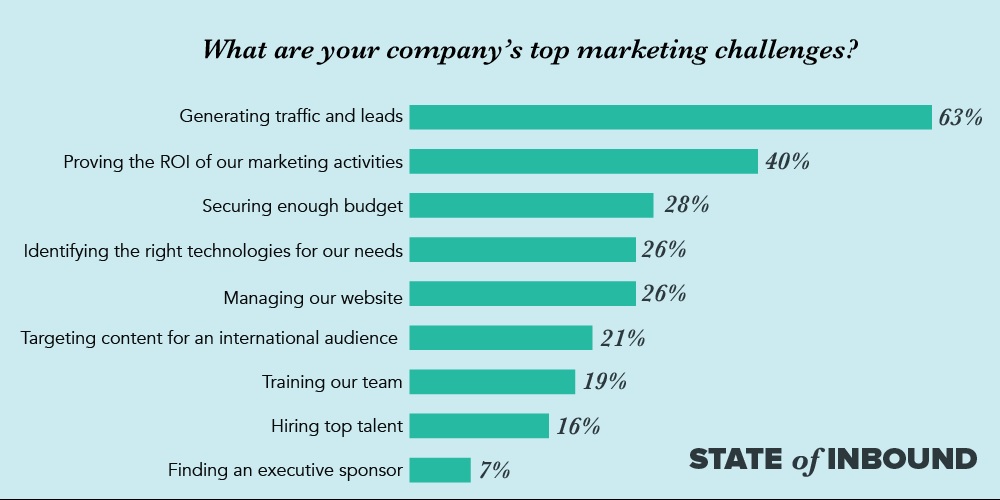
Just remember, lead generation is the most difficult marketing challenge for professionals but it is one of the most important goals among B2B companies. One way to start tackling it is by using your lead capture form, which serves as the bridge between web visitors and leads.
source: www.hubspot.com
5 Components Of A Lead Capture Form
Here, we laid down the ways to optimize each of the components with the aim of improving your conversion rate. For this, you should know how to compute campaign conversion rate.
1. Clear CTA
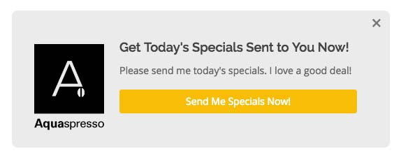
One of the most important components of a lead capture form, call-to-action or CTA is basic to any campaign but can easily be overlooked in a form. We usually associate CTA with the ad or landing page, forgetting to place one on the form. This can be as a form’s title or sign-up button.
Giving your form its own CTA is especially important if the form is placed below the fold or as a pop-up or squeeze page. That means prospects lose sight of the landing page’s CTA (it bodes well to you to keep barraging them with your CTA).
CTA using benefit as a come-on.
However, your CTA should be consistent throughout the ad, landing page and form. This ensures prospects are clear on your offer. Here are the elements that make your CTA powerful:
- Be specific on what prospects are getting. Don’t just say “Download” or “Submit,” be specific, such as “Download the ebook” or “Click to get 50% discount.”
- Use benefits for CTA. The form’s CTA button is possibly your last chance to convince prospects of the benefit you’re giving. Likewise, benefit evokes a strong persuasive message to prospects, so use it as a CTA. For example, instead of just stating our example, “Download the ebook,” add the benefit: “Download ebook for more sales.”
- Simple works. This may sound contradicting our examples above, but if you already have a compelling CTA visible around the form, a simple “Sign Up” button flows with the copy. No need to overdo stuff here.
- Free always delivers. We all like free stuff. Adding the word “free” in your CTA never fails.
2. Right number of fields
How much information does your form need to get? It’s a delicate balance between wanting more and not turning off prospects. The safe answer is–just what you need, no more, no less. So if it’s a form for first-time prospects, you’ll probably need two fields for the name and email address. If it’s a second-round of opt-in, for example targeting leads who have downloaded your white paper, then you can ask for additional data, maybe, job title and company. Provided, you’re offering something that’s more exclusive or more valuable than your initial offering. We can put it this way: the no. of fields is directly proportional to the value of your offer. People are more willing to give away information as the benefit to them gets higher.
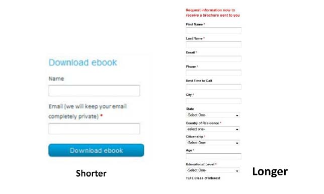
The number of fields depends on the offer you’re giving and stage where the lead is.
Going beyond the necessary no. of fields can have a significant impact on your conversion. Some say conversion rates drop as form fields increase, but context is important. For low-value offers that may be true. So, gauge your offer, how much is it worth in terms of customer data? Would you give a business your mobile number for that? Or maybe just your hardly used email address?
Depending on your marketing or sales goals, these are the information you’ll likely get in order of prospects’ willingness to give them. The farther down the list the data is, the further down the lead pipeline your offer is likely:
- Email address
- First name only
- Job title
- Company
- Surname + First Name
- Website URL
- Company details
- Phone number
- Credit card details
3. Smart features
Forms are no longer the static HTML codes that are technical and specific to a web page. Today’s form builders are replete with smart features, allowing your form to respond to device types, predict entries, score leads and even personalize fields. A good example of these smart features is the HubSpot form builder. It is designed with drag-and-drop tools that even a non-technical user can customize the form to his or her liking and embed it on the website on the fly. This app is included in the free HubSpot CRM. So if you want to check the form builder’s features you can easily sign up for HubSpot CRM here. Or should you prefer to check another forms automation software comparison, focus on smart features.
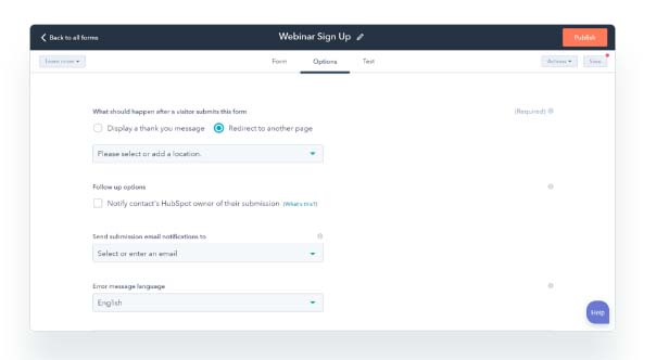
HubSpot form builder allows for triggers and automation settings.
What are the smart features you should consider when looking at the builder features of the leading CRM software solutions? Take a look at HubSpot form builder functions here to get an idea:
- Variety of field types. You can choose from text, drop-down, checkbox, radio select, date picker and more. It allows you to publish the right form for the right landing page.
- Progressive profiling. The form adapts to a prospect’s questions or shows new questions to returning visitors. When you implement a series of sign-ups, the feature allows the form to skip the stages that don’t apply to a particular prospect.
- CRM routing. A form collects the data then routed these to a CRM system. Once data is given, you can automate the lead nurturing process, from lead scoring, scheduled email follow-ups to sending more appropriate offers down the pipeline.
- Mobile responsive. The form adjusts to the right screen size when viewed from desktop or a mobile device.
- Auto-fill. The form can provide customer data culled from external sources when giver permission. It may also pre-fill the fields that have been submitted by prospect before in a different campaign.
4. Regular testing
The best way to optimize your form is to test it. It’s the only way to see clearly what work and what don’t, with real numbers. All the best practices that you see here and elsewhere can only guide your strategy. So, make it a practice to test the form, not just before launching, but during and on a regular schedule. This helps you improve on previous weaknesses and optimize the form continuously.
How do you test the form? Here are a few tips:
- Do an A/B testing. Have a control form (A) and the one that you’re testing (B). The control can be your existing or standard form. Results will show if your existing form is working just fine or can be improved by the tweaks you did in B.
- Test one element at a time. This allows you to pinpoint with accuracy the impact of the change. For example, test only the CTA or length or the no. of fields or the position of the form. Doing so won’t mix and muddle your data.
- Give the test a fixed time. Decide how long you want the test to run. Is it one day, one week, one month? Time stamping the test gives the results a more scientific way of measuring things.
- Analyze the results. Do an in-depth analysis on the findings. Often, gauging results by number of outputs isn’t the best assessment. It may hide a more important fact, for example, the quality of leads. A longer form may return fewer opt-ins, but the subscribers are more qualified along your lead definition. Identify the layers of metrics you want measured to come up with a more accurate testing.
5. Privacy is highlighted
Rounding up our key components of a lead capture form is about privacy. It’s one of the major frictions against opting in personal data. People are wary of divulging information to strangers, like you. The threat of spam, hacks and even cybercrime is real, and people know that the more data they put out in the web the more vulnerable they become. That’s why it’s important to ease this anxiety with a clear privacy policy in your form.
Don’t just flash a generic “Privacy Policy” text on the form; give it TLC to imply to prospects that you care about their privacy. For example, place the privacy policy link beside the field; it sends a strong message about your transparency. Some marketers will deliberately place their privacy terms in the most ambiguous place and language to confuse prospects, but this will backfire.

A simple privacy policy link placed next to a field reflects transparency.
GDPR: How it will impact on your web forms
General Data Protection Regulation (GDPR) is a set of EU laws on data and privacy protection of individuals in the European Union. The law also covers EU citizens’ data that are exported outside of EU, as when, for example, a French citizen subscribes to your U.S.-based newsletter. That means U.S. websites are, by extension, impacted on by this law, which took effect on May 25, 2018. But what exactly is it, and how your forms and websites can be GDPR-compliant?
Let’s spare you the jargon and details, you just need to know these important things about GDPR as it relates to your online business.
- Clearly state that submitted data will be stored and used by a company.
- Customers or subscribers should have access to their data stored in your database.
- Your engagement with subscribers should have an unsubscribe link that’ll help them withdraw any time they wish so.
As you may have noticed, many of the GDPR requirements are simply enhanced policies on what are already being done by honest marketers to protect customer data. If you’re one of them, you’ll have little to fear about the penalties of GDPR. You can also check this Investopedia guide to know more about the details on GDPR.
The Good news…
If you haven’t tried HubSpot form builder yet, we highly recommend you sign up for free HubSpot CRM here. Why? Because not only will it give you the smart features we discussed earlier. HubSpot form builder is GDPR-ready, meaning, it’ll help you create forms that meet the new requirements. Here’s the step-by-step guideline on how HubSpot can make your forms GDPR-compliant.
That said, whatever form builder you use, by following our tips above increases the chances of improving your lead volume or better yet you can take advantage of a number of free lead collection tools to do the same.


Leave a comment!